
Mobile devices have been increasing in screen size, screen resolution, memory, and other capabilities on a continuous basis from the time I got my first Apple Newton MessagePad in 1993. Back then screens were about 336×240 pixels, and each pixel was either on or off — no color. There was a total of 4.625 MB (that’s MEGA bytes) of memory. My first Windows CE device was probably my HP 620 LX in 1998. It was a “clamshell” design with a 640×240 screen and 16 MB of memory.
The thing we knew intuitively from being involved in personal computing since there was such a thing as personal computing was that “change is the status quo”. Our programs never assumed how big the screen was, because we knew our program would need to run next week on a bigger screen, so we wrote our code so that it queried the operating system to ask how big the screen was before dynamically laying out its user interface to fill all available pixels. We never assumed that devices would always be monochromatic, so we wrote our compressed file format to accommodate “words of Christ in red” before they could even be displayed in anything but black on a greenish screen. And even though the entire Bible wouldn’t fit in memory of those first devices, we plowed ahead with the best compression we could manage and a user interface that supported displaying two Bibles simultaneously, knowing that very soon you’d be able to get not just one of our Bibles but two whole Bibles onto the device at the same time.
Fast forward to the iPhone in 2007. When you work for Apple you apparently get big-headed and begin to think you’re among the smartest programmers in the world. Nobody can match your brilliance. Each generation of device you work on is “magical”. It has capabilities and features that nobody could have imagined even six months ago. Features like a more memory and a bigger screen.
Since you couldn’t imagine those features last year, and since you’re God’s gift to technology, you’re positive that nobody else could have imagined those features. So what’s going to happen to all those apps written by people “too dumb to work at Apple” when your new device with a bigger screen comes out? Why, they’ll crash, of course.
Not PocketBible.
You only have to be in this business a week to realize that you can’t hard-code your program to assume a particular screen size. But Apple does this with every single device. Up until iOS 8, we had to prepare a “splash image” to display when the program launched in every possible size and resolution. Currently, that means we have to create launch images in 13 different sizes, one for each iPhone screen size that has ever been shipped, in both portrait and landscape orientation.
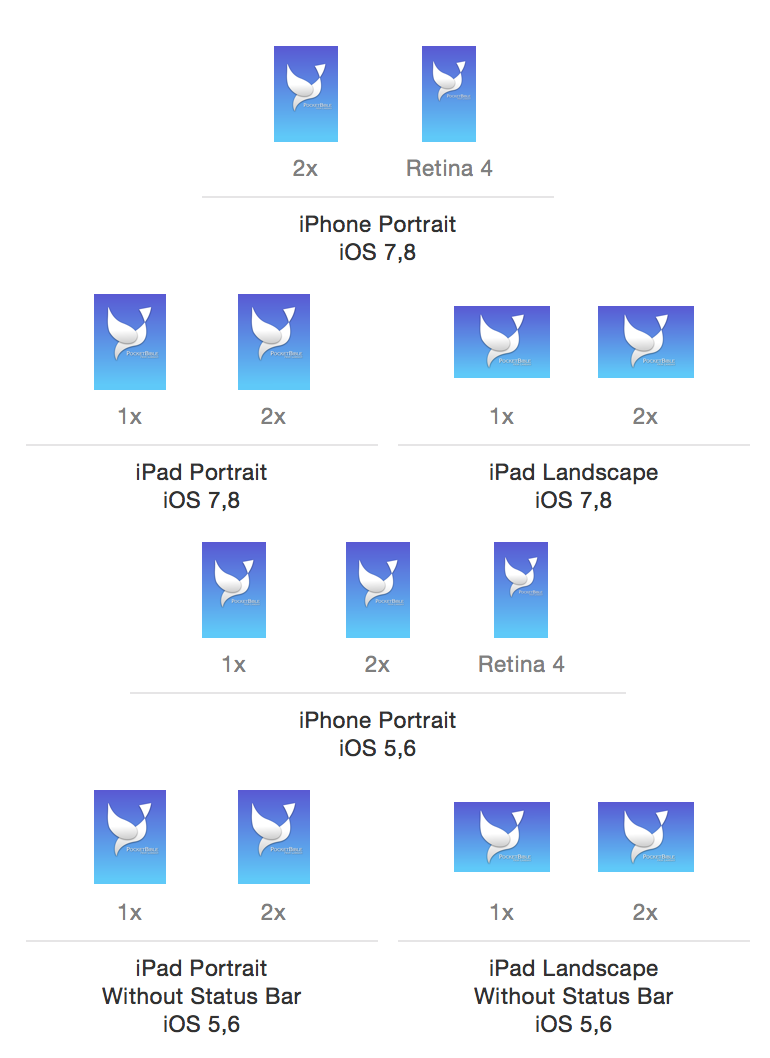
Current iOS launch image requirements
If instead they allowed us to manipulate a single image at run-time, we could do all of these with one PNG. But they require us to know every size of every screen we might ever run on (by the way, the image above omits devices prior to the iPhone 4, which would add another half-dozen sizes if they hadn’t already been abandoned by Apple).
This isn’t about managing lots of images. It’s about a philosophy that can’t think past yesterday.
Because of this philosophy, when a bigger screen comes out, Apple either “letterboxes” old apps (putting black bars in the empty space that the program couldn’t possibly imagine would ever be there) or scales them (allowing them to believe the screen is no bigger than last year’s device, then scaling up everything they draw to fill the bigger screen). They believe they are saving developers from having to re-release their apps every time a new device comes out. But in reality, they are requiring every developer to re-release their app to jump through whatever hoop is required to get Apple to stop letterboxing or scaling their apps.
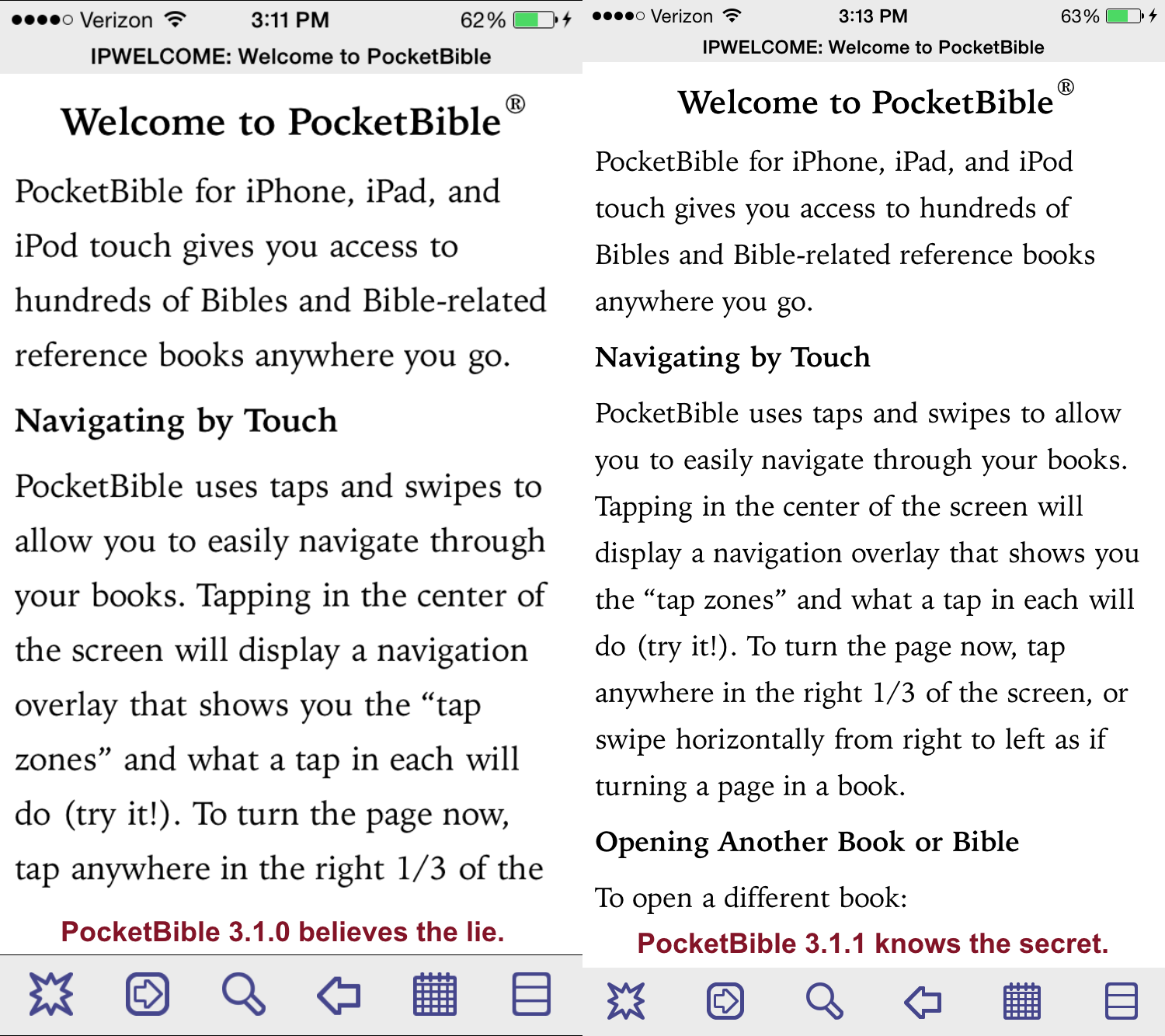
Pre-iPhone 6 version of PocketBible on the left gets scaled up. Adding a “launch screen” (which is unrelated to drawing text) tells iOS not to lie to us about the screen size, producing the sharper image on the left with absolutely no changes to PocketBible code!
With iOS 7, there was a special checkbox we had to check to tell the OS that we understood their new semi-transparent user interface elements. With iOS 8, in order to convince iOS not to scale your app (producing blurry text), you have to provide a special, scalable launch image that works on any screen size. (Gee whiz, 2015 and we’re finally recognizing that screens might get bigger in the future! Thanks, Apple!) Until you do that (which requires re-releasing your app), iOS will lie to you about the size of the screen then scale your user interface up to the bigger physical size of the screen, producing blurry text.
Oh, and you still have to provide those 13 launch images for older devices.
The result of this policy of “technical advancement by lying to developers” is that instead of one guy at Apple having to write zero lines of new code, hundreds of thousands of developers have to update and re-release their apps. There would not have been a personal computing revolution in the 80’s and 90’s if Microsoft would have taken this approach. Back then, Microsoft would collect commercial software products and use them for regression testing of new versions of DOS and Windows. After all, you wouldn’t want to do something stupid and break every single app the way Apple does with every release of the iPhone.
This industry used to be exciting. I was like a kid in a candy shop. Technology was changing and we were riding the “bleeding edge”. Now I feel like the only grown up in the room. I want to slap some of these Apple and Google kids around and tell them to shape up.